Football's 'maverick' position sustains its reputation in its fashion choices…
In the conversation of the game’s most iconic kits, goalkeeper jerseys are criminally overlooked.
In recent years, goalkeeper kits have largely lost their identity. Lent to mundanity and mainstream design, they have become unexciting and unsurprising, especially when based on templated designs.
But there was a time where goalkeeper kits were just as unique as the men and women who wear them. With kit design in professional football now diversifying more than ever, more novel goalkeeper jersey designs are back on the rise.
That being said, there's nothing like a classic. Below, we've chronicled four of the greatest goalkeeper kits of all time.
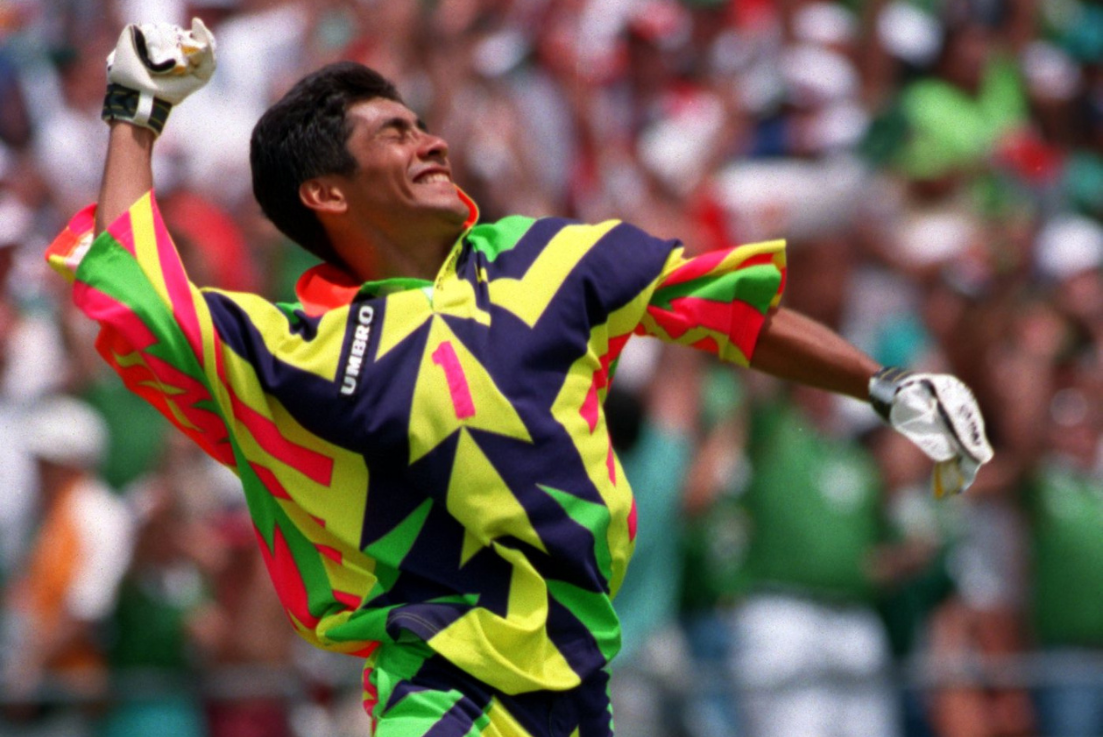
The Mexican Maverick at the 1994 World Cup
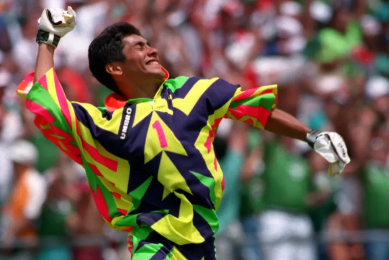
It was July 1994 in the blistering American heat. The World Cup round of 16 tie between Mexico and Bulgaria has gone to penalties. Standing in the way of the Eastern European nation is Jorge Campos, sporting one of the most outlandish goalkeeper kits of the century. The North American’s jersey was dominated by luminous yellow, green, and pink zigzags and triangles, intercepted by narrow blue strips on the arms and shorts.
The colours starkly intertwined to make Campos look like a canvas attacked by an uncontrollable child with a paintbrush. For the Bulgarians, it was a mission to remain undeterred and undistracted by his blinding presence. Krasimir Balakov stepped up first and side-footed his penalty to Campos’ right. The shot-stopper flung himself – with his oversized jersey making him look like multi-coloured parachute – and he miraculously saved the shot.

Unfortunately, Mexico only netted one penalty and Bulgaria scored all their remaining efforts.
This match and Mexico’s tournament are largely remembered for Campos’ clothing. His kits became symbolic of his goalkeeping: chaotic, captivating, and unconventional. Umbro, Mexico’s kit manufacturers, fuelled Campos’ eccentric nature and permitted the player to design his own shirts.
The result was a random concoction of many colours, merged into a frenzied shape-shifting masterpiece.
Campos, who was well under six foot, assumed an acrobatic and eye-catching goalkeeping style, cannoning through the air to collect crosses and propel himself to all corners of the net like an exotic bird of prey.
His shirts became emblematic of a decade that encouraged and popularised outrageous goalkeeper garments. He was the Mexican maverick who would always keep you guessing.
Seaman's Safe Hands at Euro 96
The biggest game in English football history on home soil since the 1966 World Cup Final. England against Germany in the semi-final of Euro ‘96 at a buoyant Wembley Stadium. Old foes reunited on the international stage.
The players line up for a pre-match picture. Gareth Southgate looks like a schoolboy. Short haircut, no facial hair, whilst sporting an all-grey uniform that blends into the adoring crowd. Next to the now-England manager stands David Seaman, boasting an impeccable moustache and Umbro’s unmissable patchwork-style shirt. It's a vibrant red with bright yellow, green, and purple squares splattered across the chest and arms.
Any doubt over its tradition is definitively discarded by the giant England badge, located on the border of a smaller badge at the front centre of the shirt. The next inexplicable feature is the capitalisation of ‘ENGLAND’ in black and yellow just under the badge.
Incredibly, the kit abandons all laws of symmetry and digestibility as only the left-hand side of the shirt replicates the multi-coloured chequered design that dominates the top.
After a pulsating 120 minutes, the match went to penalties. Given the pedigree of ‘Safe Hands’, coupled with the kit's audacity, there was hope this could be a decisive factor in the shootout. But, under immense pressure, the Germans remained typically composed, scoring all six spot-kicks.
Southgate missed in sudden death as England followed the same familiar storyline: a heartbreaking departure from a tournament on penalties. The debut of this kit in the competition ended in despair.
Some see the former Arsenal man’s outfit as an abomination, others as an artistic breakthrough, but the eye-watering design is perhaps the most memorable attire sported during match minutes by an English footballer in history.
Real Madrid’s Short-Sleeved Masterclass
In stark contrast to the experimental style of the 1990s, Real Madrid, Adidas, and Siemens Mobile combined to assemble an underrated collectible. In the 2003/04 season, at the height of the Galactico movement, Los Blancos’ goalkeeper kit was a potent amalgamation of fiery orange, blazing yellow, and bold black.
The shirt has orange as the base colour, which is intersected by thin narrow black lines to create a mesmerising symmetry. The Adidas logo and Madrid badge are centralised, while the bottom of the jersey and the sleeves effortlessly fade from black to orange. The tops of the sleeves are decorated with extravagant yellow and orange stripes, which are separated by a pronounced black collar.
The clean and classy design was befitting of the royal club in Spain and one of Europe’s most elite footballing powerhouses. The shirt’s heritage stemmed from its model. Academy graduate Iker Casillas was awarded the opportunity to regularly flaunt this wonderfully crisp garment. The then 22-year-old looked like a model, adopting the short-sleeve look that became synonymous with his trophy addiction at the Santiago Bernabeu.
This kit brilliantly encapsulated its era as the early 2000s merged simplicity with aesthetics to create an era of timeless goalkeeper clothing.
Wycombe Wanderers’ Methodical Madness
Back in 2017, O’Neills and Wycombe Wanderers linked up to produce a fluorescent yellow goalkeeper jersey, bolstered by a captivating green, blue, pink and purple kaleidoscope pattern. The psychedelic shirt could have been a staple item at the Woodstock festival, but from a sporting perspective, there was a method behind the madness.
Former Wycombe goalkeeper coach Barry Richardson played a key role in the design and wanted to create a kit to distract the opposition’s attackers and enlarge the shot-stopper’s presence. The pattern was intended to resemble a target, catching the striker’s attention and disturbing his aim with its “disruptive magic-eye effect.”
Six years later, this tactic has been reinstated, but in a far more attractive form. O’Neills have been replaced by Hummel, who have provided the Chairboys with a corker. The club’s latest goalkeeper shirt is a slick purple, accompanied by a striking yellow and pink kaleidoscope, partially mirroring the 2017 piece.
The badge is also purple – adapted and colour-coordinated to complement the shirt: an exquisite tweak. There are black and white chevrons on the shoulders to emphasise its individuality.
Nowadays, goalkeeper kits have largely lost their identity. Lent to mundanity and mainstream design, they have become unexciting and unsurprising. But in the depths of the English third-tier, Wycombe stands alone with the best shot-stopping shirt of 2023.


