
'Sometimes maybe good, sometimes maybe kit…'
If you want to measure how seriously a football club takes itself, don’t look at the striker’s shirt or the sponsor on the front — look between the sticks. Goalkeeper kits have always been football’s wildcard, a space for eccentricity, rebellion and, occasionally, outright crimes against fashion. From Jorge Campos’ technicolour dream kits to René Higuita’s acid-trip excellence, the history of the goalkeeper shirt is a long, proud tradition of going against the grain.
For years though, it has felt like that spirit had been ironed out. The 2010s were an era of monochrome templates, with Adidas and Nike content to churn out endless variations of black, navy or neon green, differentiated only by a badge. A once-mad genre had its spikey edges, angels and geometric eccentricities flattened into bland uniformity. But you can never truly stamp that out, in an age that sometimes excessively embraces modernity and toned back design there are a few pushing against the status quo.
Whether they always work or not is a different story but at least they’re giving it a go. Some of it’s beautiful, some of it’s baffling, and some of it is so bad it manages to circle back to being good again.
Here’s a rundown of the best, the worst and the most gloriously bizzarre goalkeeper kits the new season has to offer.
Good
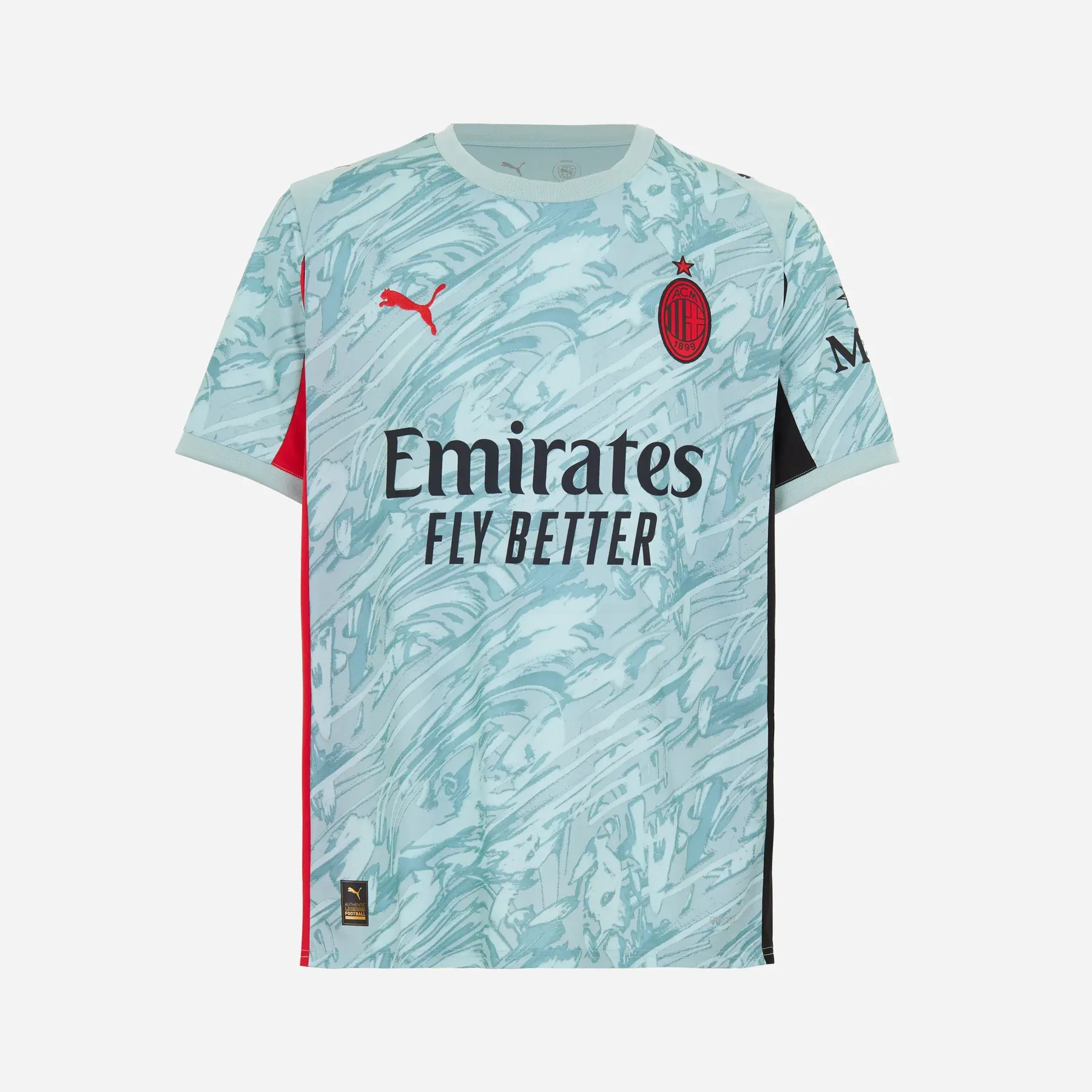
AC Milan
Look, I know it’s a template and it goes against much of what I’ve just said, but it’s nice! The Puma design might be a copy-and-paste job across clubs, but it’s done with just enough thought here. The red-out badge, the miss-matching armpits, the modern mint body — it all just works. A rare example of minimalism that doesn’t feel like it’s had its soul surgically removed.
Bristol City (Away)
Bristol launched all three of their goalkeeper kits on the same day, and while none of them are duds, the blue away shirt is the standout. The geometric, almost Rubik’s cube-style pattern makes your eyes dance. It’s part illusion, part rave flyer, part shirt. It’s not hard to imagine this shirt living a double life: worn in the goalmouth one weekend, then pulled on over a pair of swim shorts the next — sunburnt, dancing on a beach in Ibiza, drink in hand, watching the sun go down before shuffling into a neon-lit superclub. What more could you want from a football shirt?
Coventry City
This one’s got a story to it — always a good sign. To mark 20 years at the Coventry Building Society Arena, the club has drawn inspiration from the stadium’s distinctive steelwork for an angular purple-and-yellow design that feels properly unique. It’s bold, a little odd, and crucially, it’s rooted in place.
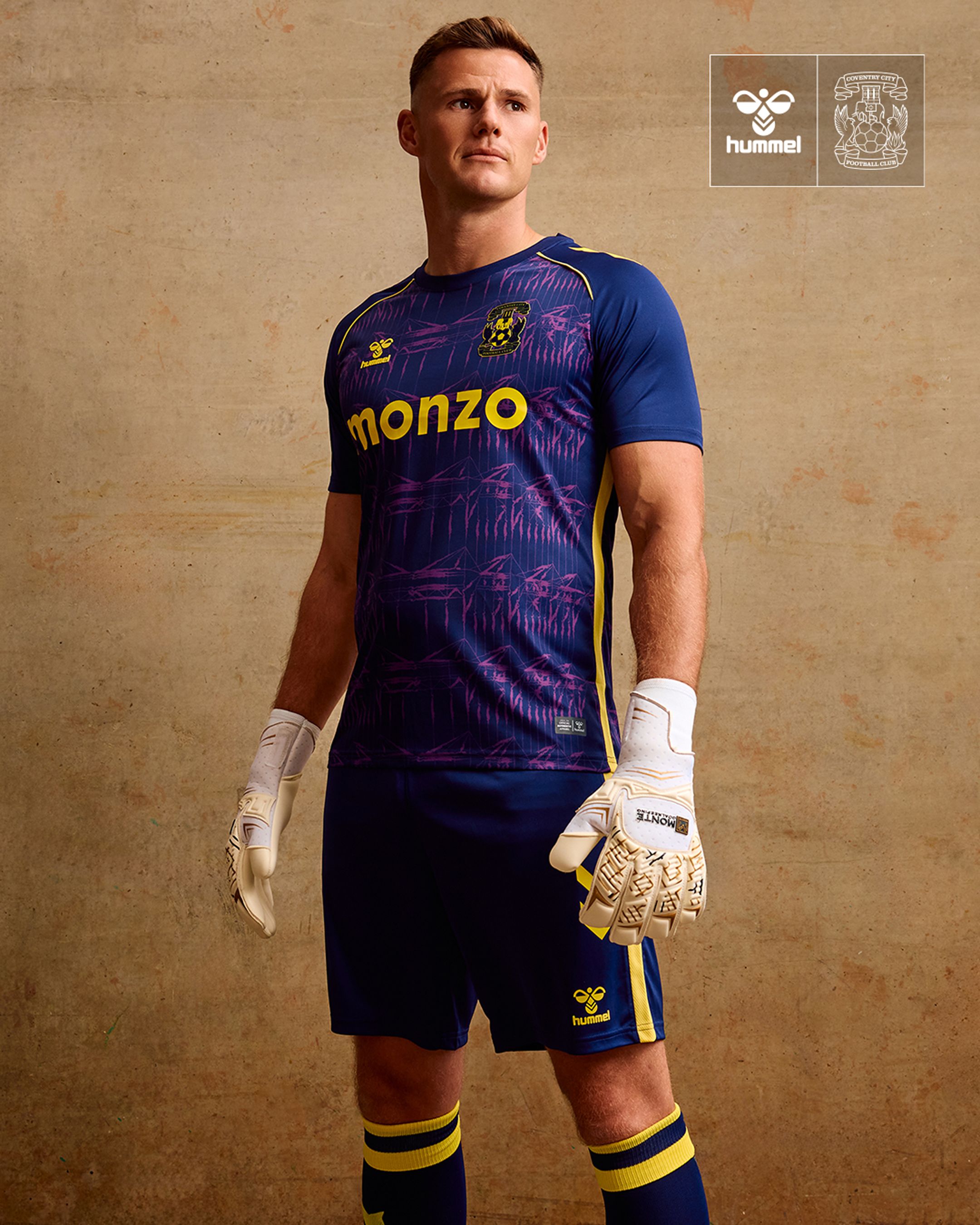
At a time when so many clubs talk about identity while rolling out soulless marketing misfires, Coventry have stitched a bit of their soul into the fabric. It’s a reminder that a shirt can be more than just a top — it can be an anchor, a memory, a bit of history you can wear. Fans want to feel connected, and it’s always better when a kit actually tries to make that happen.
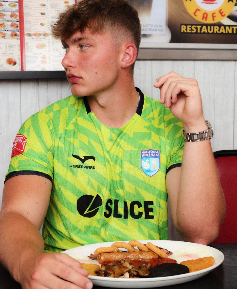
Walton & Hersham
A proper, old-school goalkeeper kit from the Swans. Lime green and yellow, with a pattern that looks like a 90s bus seat — a bit retro, in a good way. Somehow, it’s inspired by their new sponsor Slice Mobile (they do eSIMs, apparently), though it feels more like a tribute to an era of mad kits, mad goalkeepers, and even madder defending. You can picture it perfectly: a half-blurry, half-pixelated Getty image from 1995, the goalkeeper screaming at a flat back four, rain coming in sideways. Proper football.
The Worst
Nike Template (Barcelona, Chelsea, PSG, Netherlands, England, etc.)
Nike’s 2025/26 goalkeeper kit is less of a design and more of a shrug. They’ve copy-pasted the same uninspired template across nearly a dozen teams, and none of them look particularly happy about it. A kit that was designed by committee and approved by spreadsheet. If you’re going to mass-produce, at least mass-produce something with a bit of life. France’s is the least bad of the bunch, which isn’t saying much.
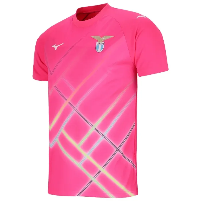
Lazio (Home GK)
I’m all for a pink goalkeeper kit — when it’s done well. This isn’t. It looks like someone tried to modernise tartan while riding a Blackpool Waltzer. The jagged lines are a headache, the shade of pink is off, and it doesn’t seem to fit with anything Lazio have done before or are trying to do now. It’s not bold enough to be fun, not clean enough to be smart. Just bad.
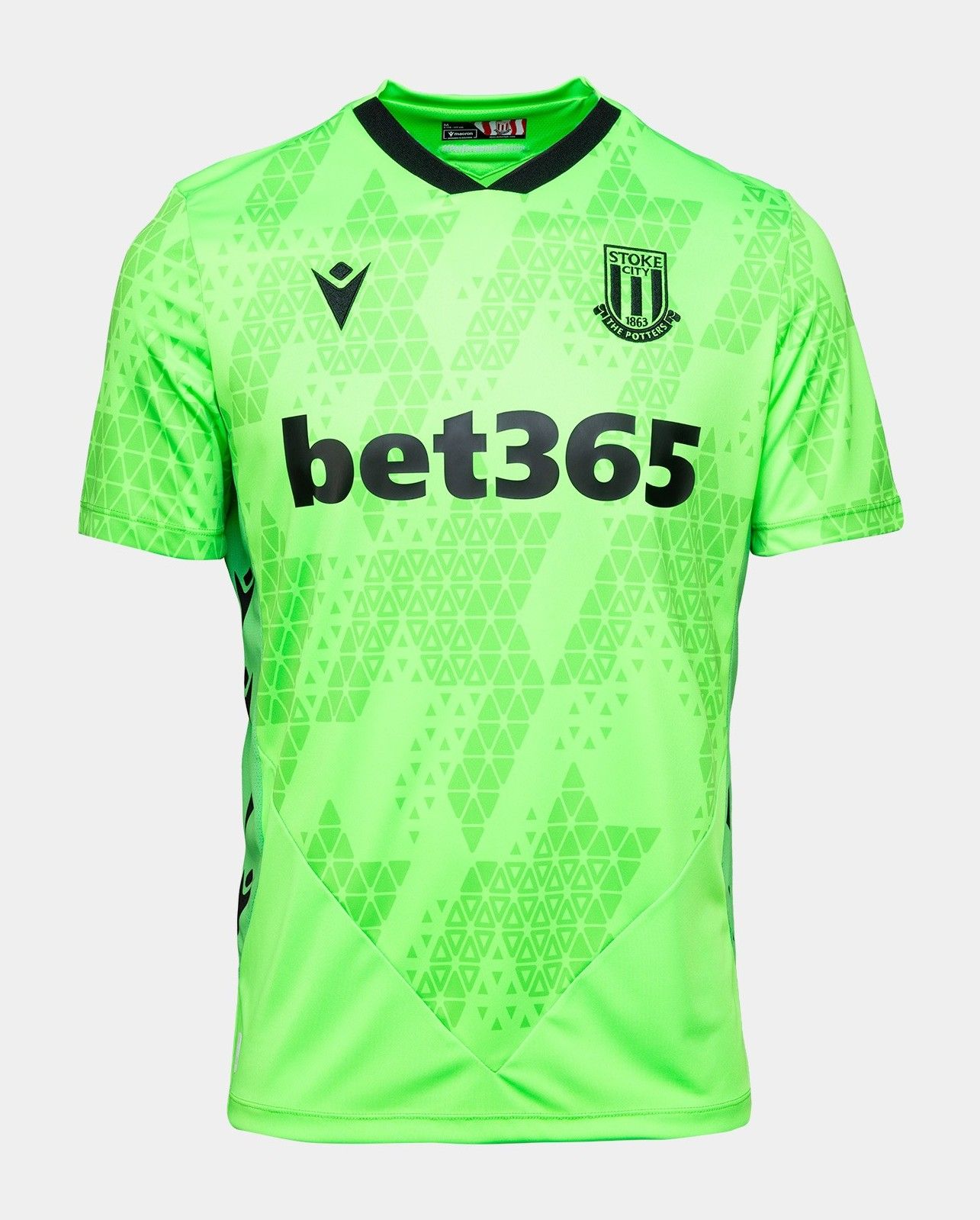
Stoke City (Away)
This one feels a bit unfair to specifically pick on Stoke because it’s such a familiar kit archetype — but that’s exactly the problem. Highlighter lime with a barely-there pattern lurking in the background, it’s the kind of shirt that thinks it’s standing out but is really just another painfully generic design. You’ve seen this a thousand times before, and you’ll see it a hundred more this season alone.
Wycombe Wanderers
I swear I’m all for pink goalkeeper kits — when they’re done well. But this one misses the mark. The shade, which is the hardest thing to get right, is wrong.Then there’s the pattern, which looks like someone wandered into a Yayoi Kusama exhibition, got inspired by the polka dots, and then asked themselves, “How can I turn this into something bad?” In its defence, at least it tried, and we should encourage that.
The Maddest
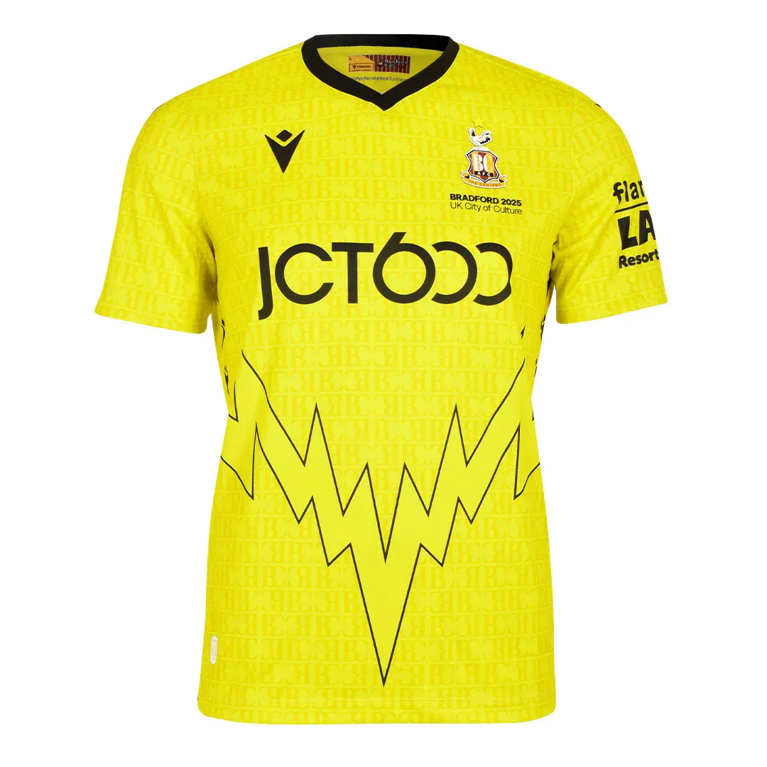
Bradford City (Away GK)
There’s a giant lightning bolt V across the chest. That’s it. That’s the kit. Is there some hidden connection between Bradford and electricity we’ve missed? Was Nikola Tesla born in West Yorkshire? Is it a nod to a Pokémon? Who knows? Who cares? It’s bold, a bit baffling — exactly what you want from a goalkeeper kit.
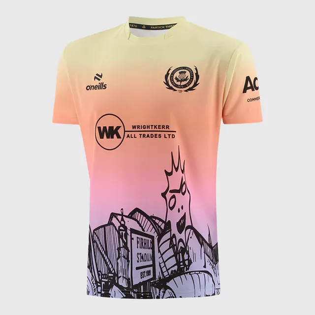
Partick Thistle
This thing has everything. A yellow-to-purple gradient like a sunset you have to whip your phone out and earnestly take a picture of, Glasgow landmarks sketched into the design, and even an image of their unhinged mascot Kingsley — that pointy, terrifying, sun-like creature from your sleep paralysis. It looks like something the Teletubbies would wear if they were from Govan and looking for a square go.
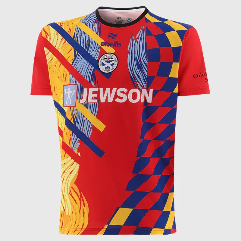
Ayr United
I genuinely don’t know where to start. There’s a chequered pattern that might be a flag, a flame effect, and what could even be hair? They’ve thrown the kitchen sink at it. It’s a lot. But it’s also proper goalkeeper kit-making. Is it good? No. Is it fun? Absolutely.
The goalkeeper kit industry of 2025/26 is a fractured landscape. Some clubs seem to view it as an extension of their lifestyle range (I’m looking at you, Adidas, with your leaked-but-not-yet-released trefoil third keeper kits), while others see it as a rebellion against football’s increasingly templated, risk-averse design culture. Where big-brand outfield kits chase safe, global appeal, the goalkeeper shirt remains one of the last opportunities a club has to get weird — to take a risk. And it would be great to see more clubs doing just that.
I’m not saying we need to bring back every bit of ’90s maximalism, but there’s something more vital underneath it too.
Football’s at its best when it’s a bit ridiculous — so let it be ridiculous every now and then.


